Keeping gestures intuitive
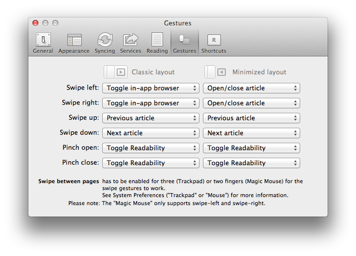
Reeder for Mac is one of my favourite and most used pieces of software. It came out around the time that Apple started emphasising the use of gestures for OS X and Reeder for Mac was not shy about incorporating these amazing features, and even making them customisable. I particularly like the ability to swipe1 left to open the article in the in-app browser view and use it regularly.

Swiping gestures have a feeling of “pushing” layers about. The “reverse” scrolling on OS X Lion (which of course came from iOS) is most easily explained to a newcomer to the concept by explaining in terms of a large sheet of paper on a desk. If you want to see what is towards the bottom of the paper, you push (or wipe) the sheet upwards. If you want to see what is on the right hand side of the paper you push it to the left.
In a similar vein, if you have multiple pieces of paper on top of one another, you can swipe the top piece aside in order to expose the next piece down. You can then swipe the original top sheet in the opposite direction to put it back where you got it.
I instinctively model the article view in Reeder for Mac as a sheet on top of the browser view. When I swipe left to expose the browser view my mind assumes that I have pushed the article view aside to get to the browser view2. As a result, my mind instinctively wants to swipe right to return to the article view.

The preferences support this by allowing you to use Swipe left and Swipe right for the same behaviour - “Toggle in-app browser”. This is a waste of a gesture - why not allow Swipe left for the in-app browser, and Swipe right for, say, toggling the Readability mode. Then the opposite gestures can be used to return to the article view, not using the same gesture again.

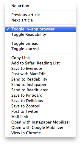
Selecting Swipe left presents a substantial like of actions that can be assigned to the gesture. For fans of customisation this is great, but offering this level of configurability means that an intuitive use of gestures cannot be offered. To do so would require a set of gesture preferences for every view in the application, which would be unworkable.
Gestures are in danger of becoming shortcuts to key commands and toolbar buttons. This is a waste of the fantastic ability that gestures offer - manipulation. Manipulating objects with pinch-to-zoom or rotations, navigation with swipes. These are the natural uses for gestures.
Toggling settings are where buttons are happiest.